Case Study 02 / Mobility & Transportation

TAÏSSIR

A smart ride-sharing identity built for the MENA region. Movement, direction and progress — a visual language designed to work seamlessly across Arabic and Latin scripts.

ClientTaïssir Mobility
Year2024
RoleBrand Identity, Art Direction
DeliverablesLogo, App, Campaign, Guidelines

The brief

Taïssir needed a brand that could compete in a crowded mobility market while feeling locally rooted and globally credible.

Moving people forward

The name "Taïssir" means facilitation and ease in Arabic — the core promise of the service. The challenge was to translate this into a visual system that feels fast, reliable and technologically advanced without losing cultural warmth.

The brand needed to work across two scripts (Arabic and Latin), multiple touchpoints (app, vehicle, social, print) and communicate trust to both drivers and passengers.

  • Market MENA Ride-sharing
  • Audience Urban professionals, 18-45
  • Challenge Bilingual identity system
  • Goal Trust + speed + local relevance
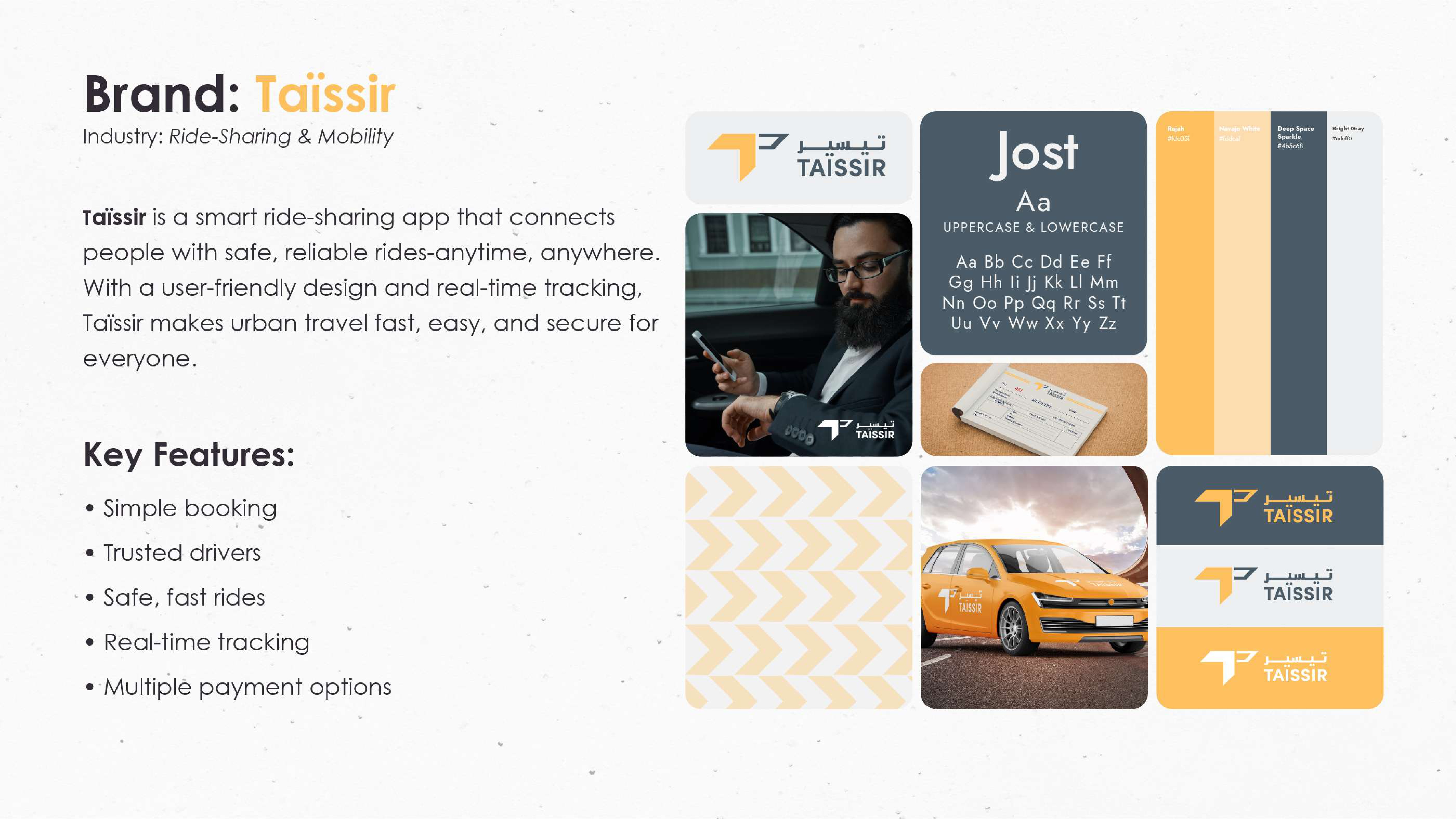
Taïssir brand strategy overview

Logo &
construction

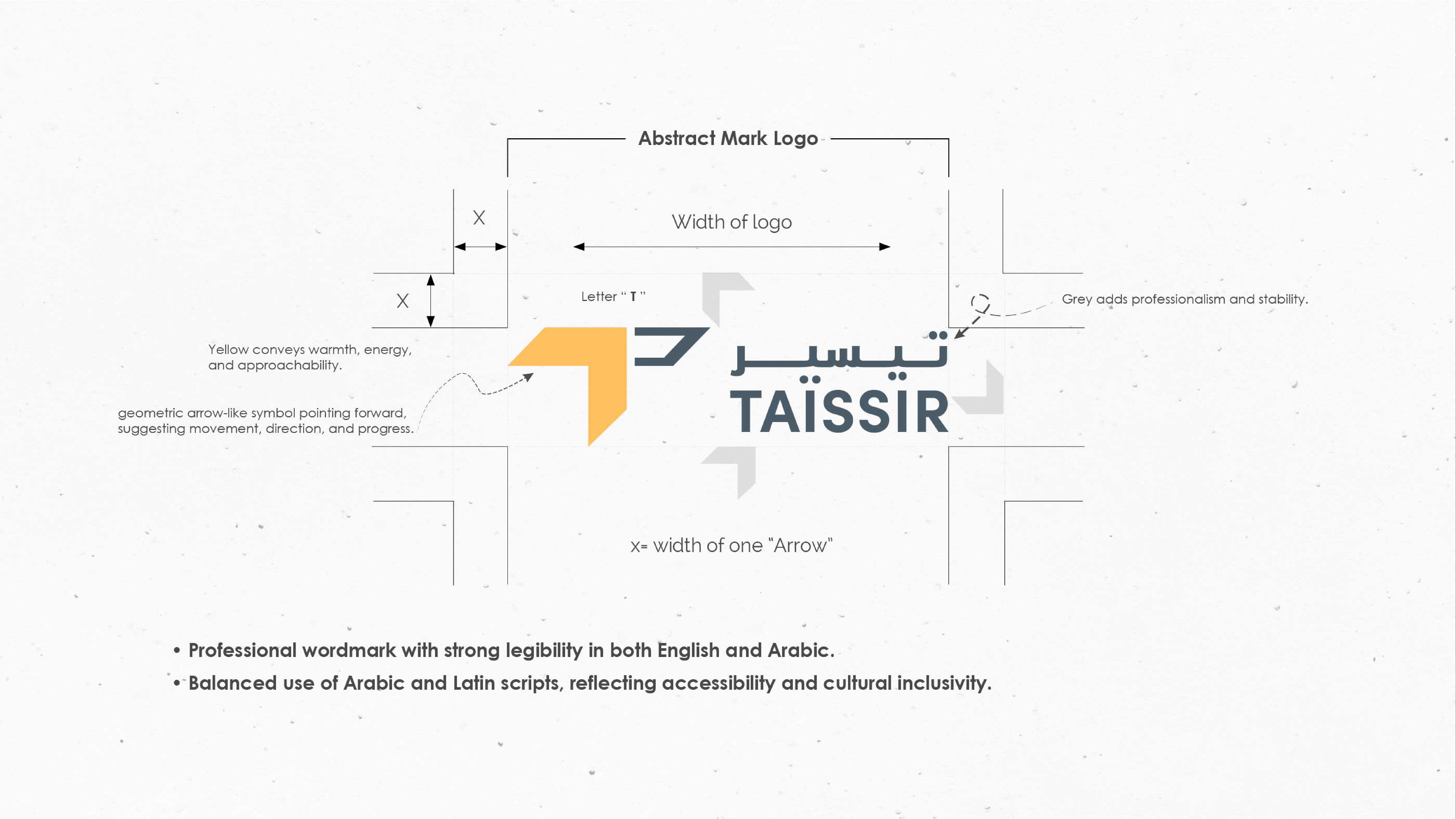
Every angle, curve and proportion was built around the idea of forward motion.

Taïssir logo construction and grid

Directional geometry

The logo mark is built from a single directional arrow that doubles as an abstract "T" — suggesting both the brand initial and the act of moving forward. The angle is precisely 23.5°, evoking momentum without aggression.

The Arabic wordmark was drawn from scratch to mirror the Latin construction — same weight, same rhythm, same forward lean. Both lockups share a common baseline grid so they can swap seamlessly across any surface.

  • Mark Geometric arrow + T monogram
  • Angle 23.5° forward lean
  • Scripts Arabic + Latin bilingual
  • Grid Unified baseline system

Color &
typography

A system that feels electric on screen and authoritative in print.

Gold
Cream
Slate
Ice
Aa تاء
Manrope + Custom Arabic companion · Weight 400–800

Application &
touchpoints

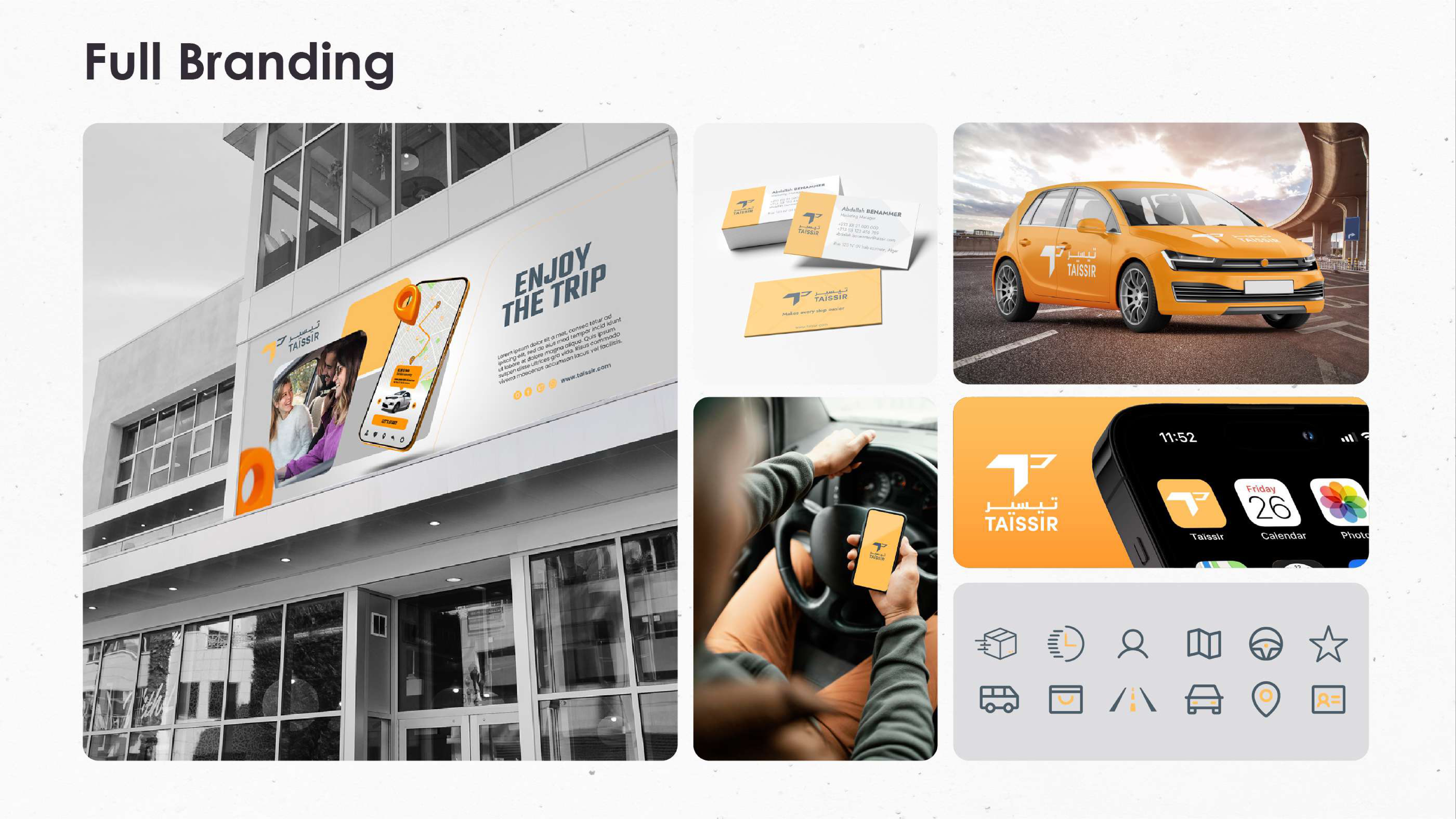
From app icon to vehicle wrap — one system, infinite surfaces.

Everywhere the brand moves

The identity was designed to scale from a 40px app icon to a 4-meter vehicle wrap without losing impact. The directional arrow mark works as a standalone app icon, a social avatar, and a pattern element.

For the app interface, we developed a dark-first UI system using Navy as the primary canvas — reducing eye strain for drivers at night while making the teal accent pop for call-to-action moments.

  • App iOS + Android interface
  • Vehicle Car wrap + driver kit
  • Social Template system
  • Print Posters, flyers, billboards
Taïssir app mockups and branding
Taïssir full brand application
"A brand that moves as fast as the service it represents."
— Hocine Belmadi, Art Director
Previous case study

Charme ↗