Case Study 01 / Clean Beauty & Cosmetics

CHARME

A clean-beauty brand pairing botanical extracts with proven actives. The identity focuses on softness, care and an elegant natural character — premium without being cold.

ClientCharme Beauty
Year2024
RoleBrand Identity, Packaging
DeliverablesLogo, Packaging, Guidelines

The brief

Charme needed a visual system that could stand out in the saturated clean-beauty market while feeling authentically botanical and scientifically credible.

Science meets nature

The brand sits at the intersection of botanical tradition and modern dermatology. The visual identity had to communicate both — the warmth of natural ingredients and the precision of clinical formulation.

Every design decision was filtered through three words: soft, trustworthy, and quietly luxurious. Nothing loud, nothing trendy — just a system that feels like it has always existed and will last.

  • Market Clean beauty / Skincare
  • Audience Women 25-40, conscious consumers
  • Challenge Stand out without shouting
  • Goal Trust + elegance + botanical warmth
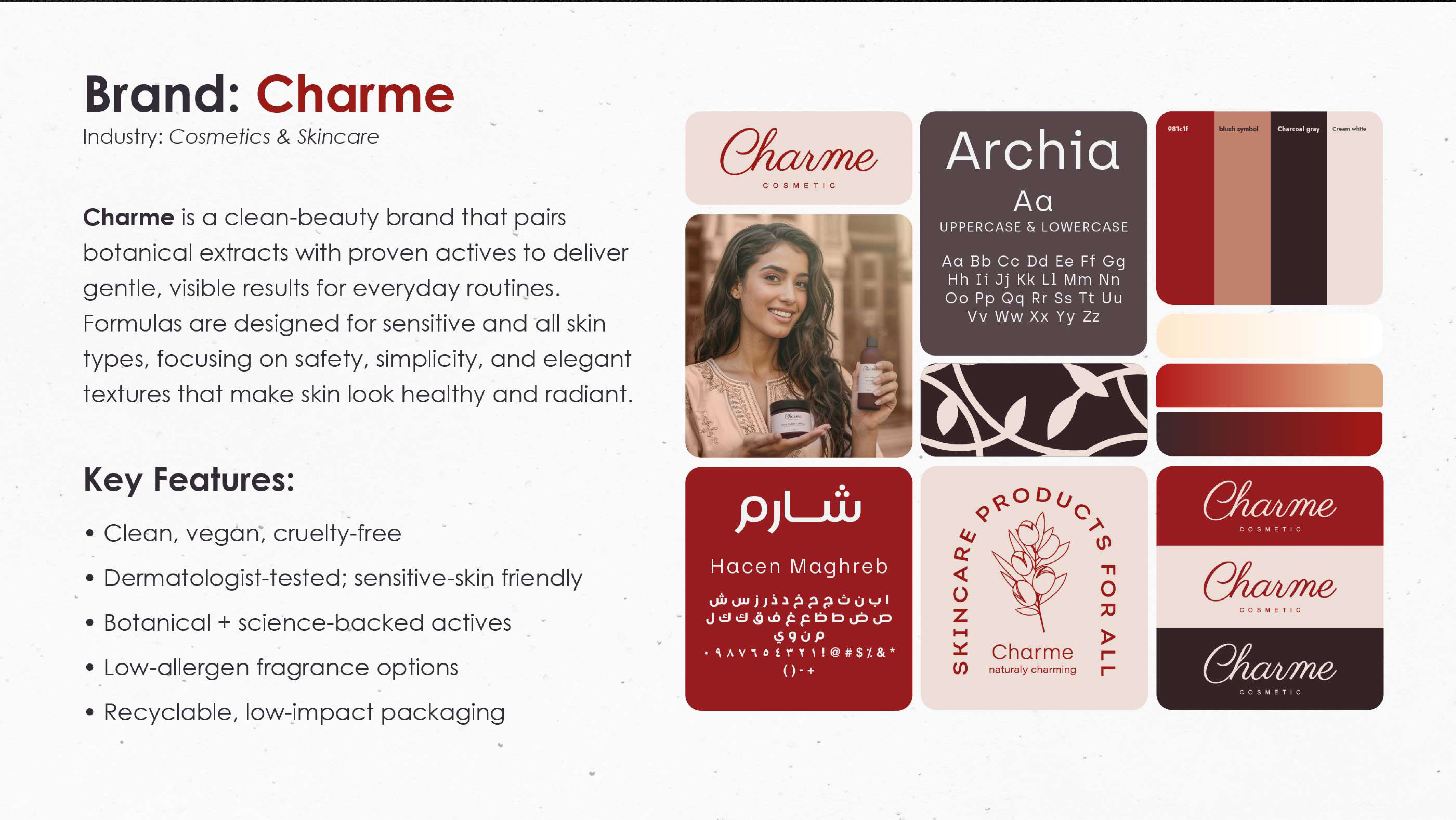
Charme brand moodboard and strategy

Logo &
construction

A wordmark that feels like skincare — gentle, intentional, and memorable.

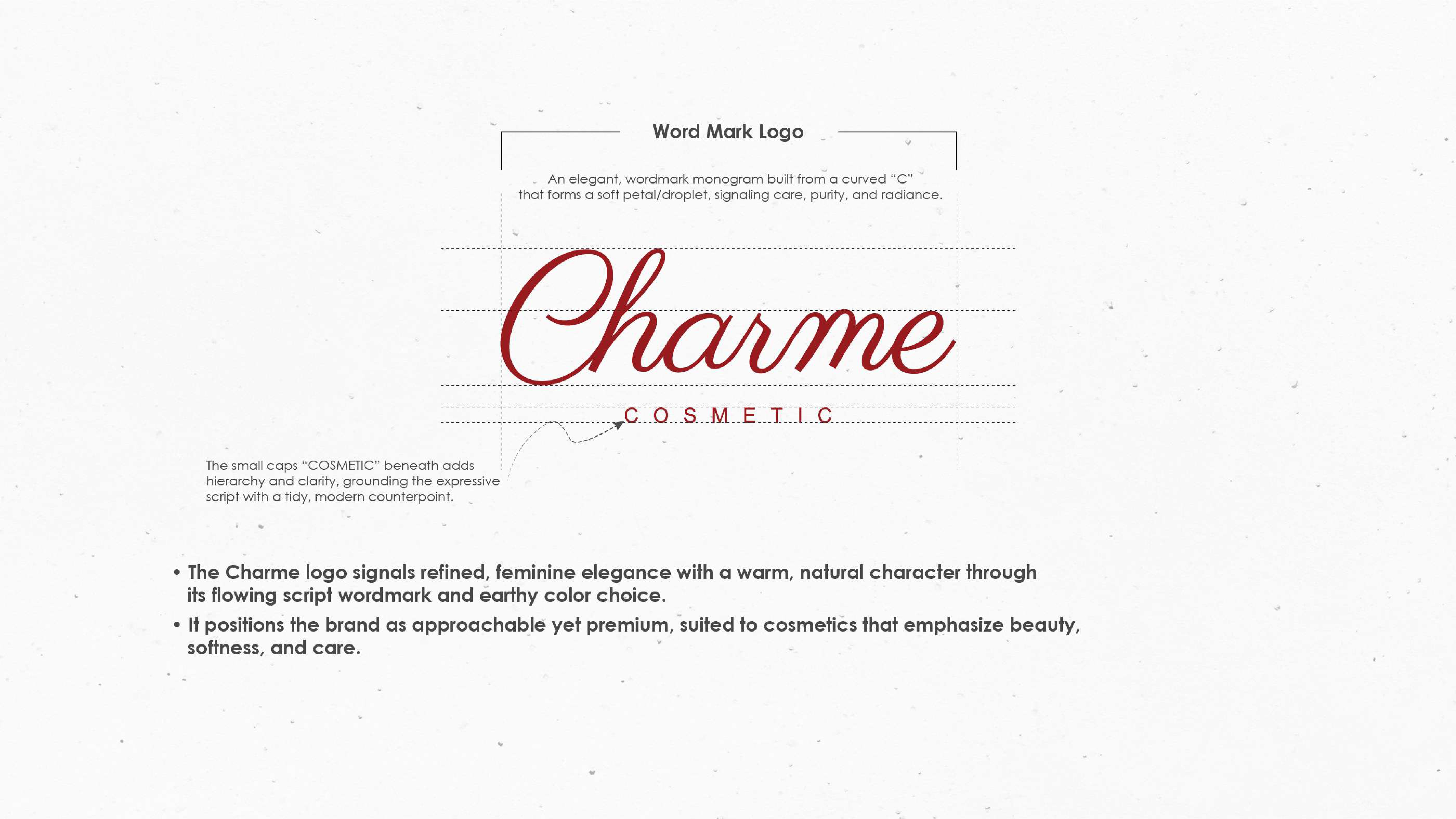
Charme wordmark logo design and grid

Organic geometry

The Charme wordmark is built from custom letterforms with subtly rounded terminals — evoking the softness of petals and the precision of a formula. The "C" and "e" share a common curve language that creates rhythm without being obvious.

The letter spacing is intentionally airy, giving each character room to breathe — just like the product philosophy. At small sizes, the mark holds its elegance. At large scale, the curves reveal their craft.

  • Style Custom wordmark, organic sans
  • Spacing Air + 120% tracking
  • Construction Grid-based, 8px unit
  • Variants Horizontal, stacked, icon

Color &
typography

A palette drawn from earth and bloom — warm, grounded, and alive.

Bordeaux
Blush
Charcoal
Cream
Charme
Manrope + DM Sans · Weight 400–700 · Organic terminals

Packaging &
touchpoints

Every surface is a promise — from the first unboxing to the daily ritual.

The unboxing experience

Packaging was designed as a tactile extension of the brand promise. The outer box uses an uncoated stock with a debossed logo — you feel the brand before you see it. Inside, products sit in a sage-green tray with botanical illustrations that hint at the ingredient story.

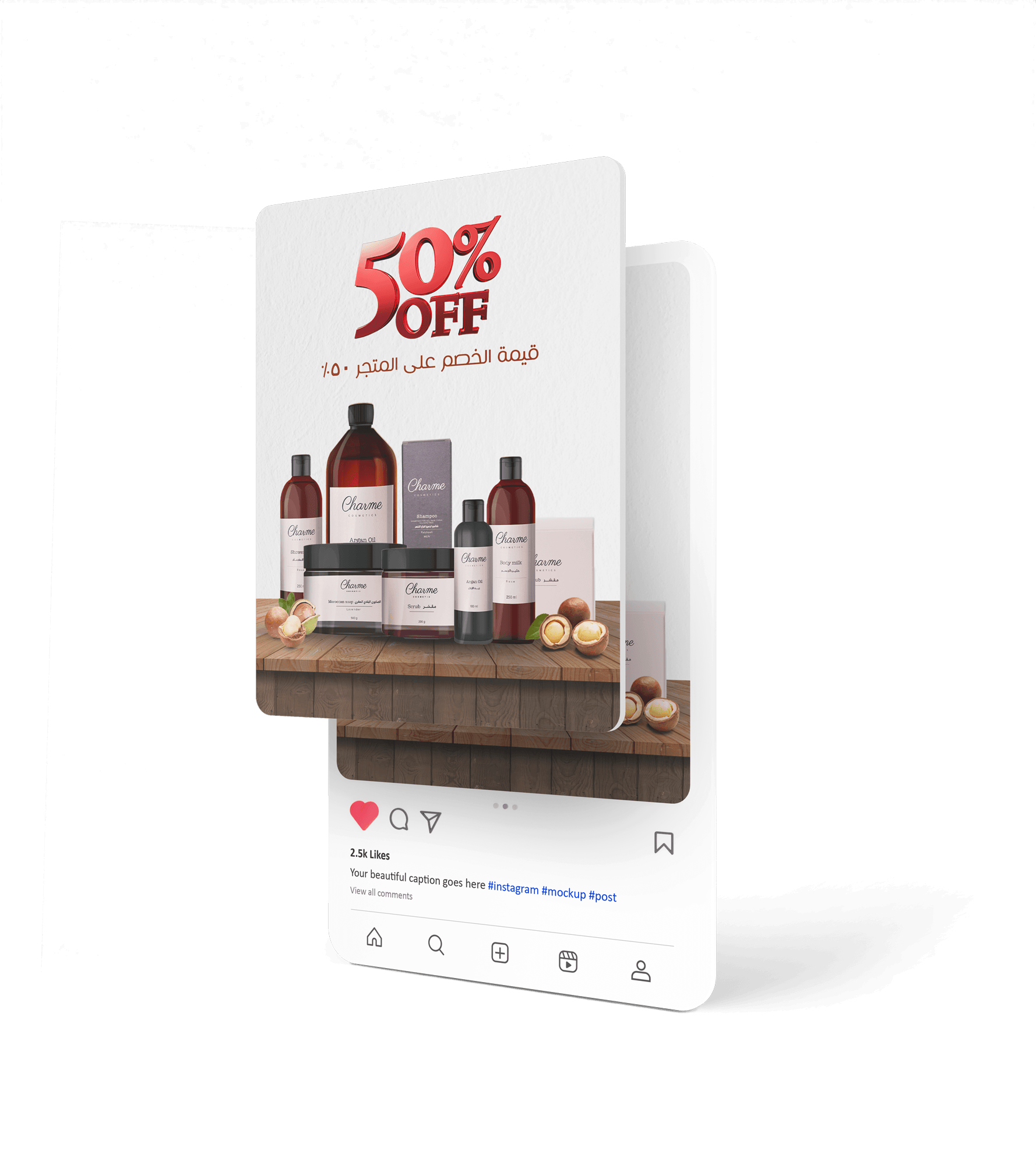
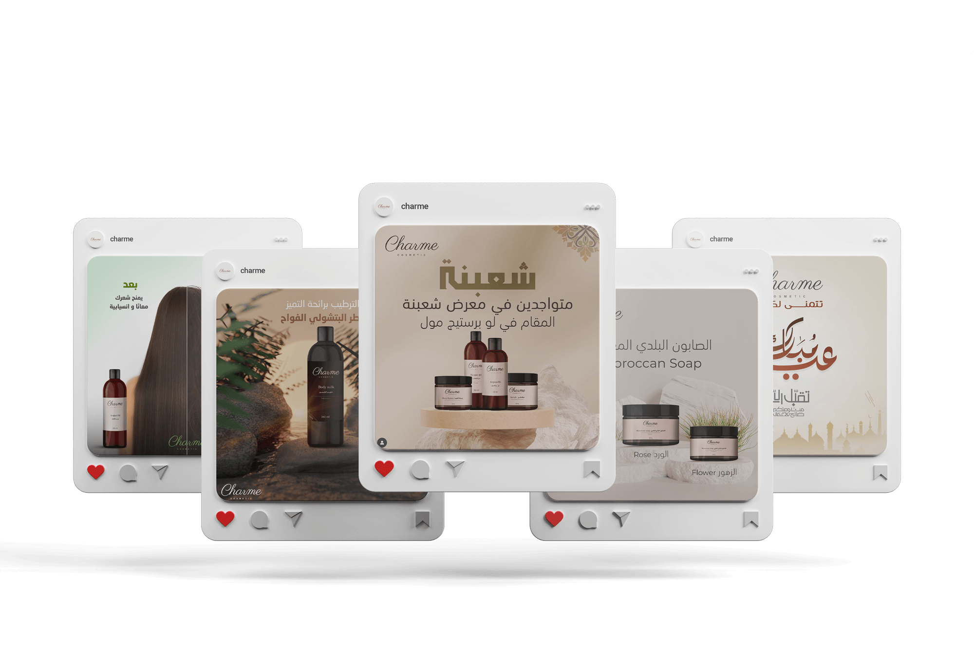
For social media, we built a template system using the color palette as scene backgrounds — each product line gets its own color world, making the feed feel like a garden in bloom.

  • Box Debossed, uncoated stock
  • Bottle Frosted glass + sage label
  • Social Color-coded template system
  • Print Editorial lookbook, 48pp
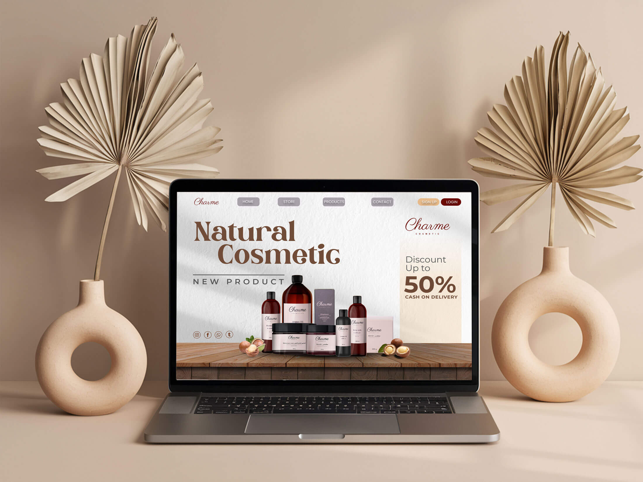
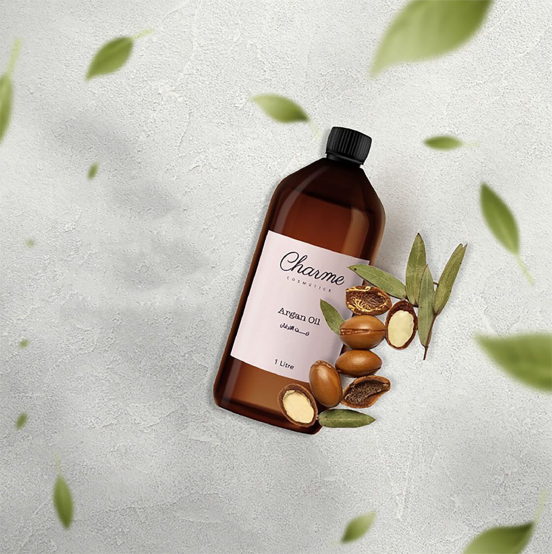
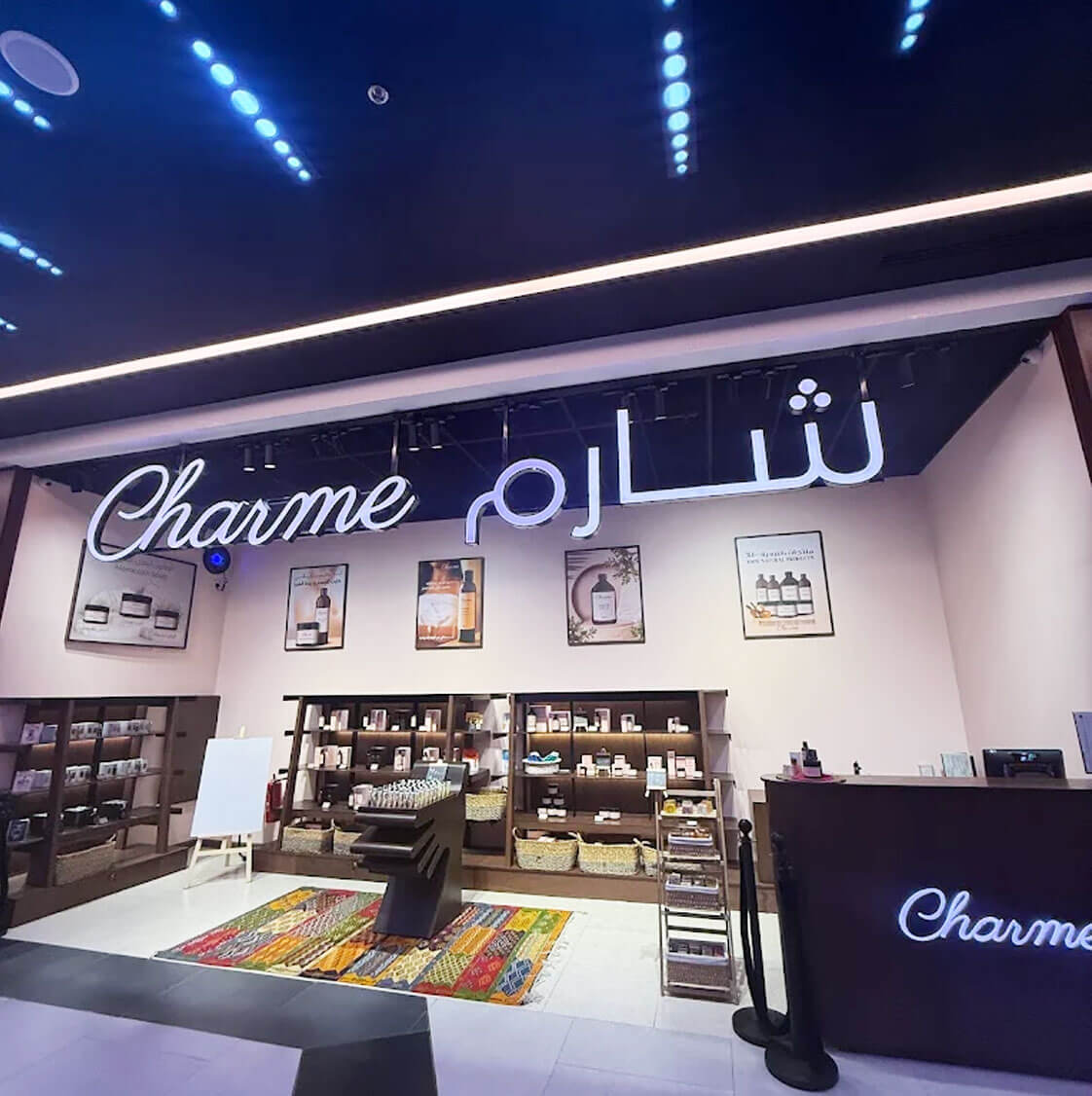
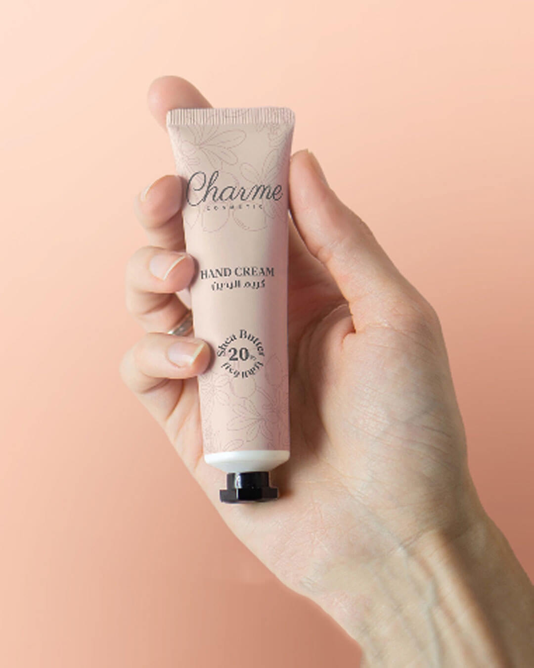
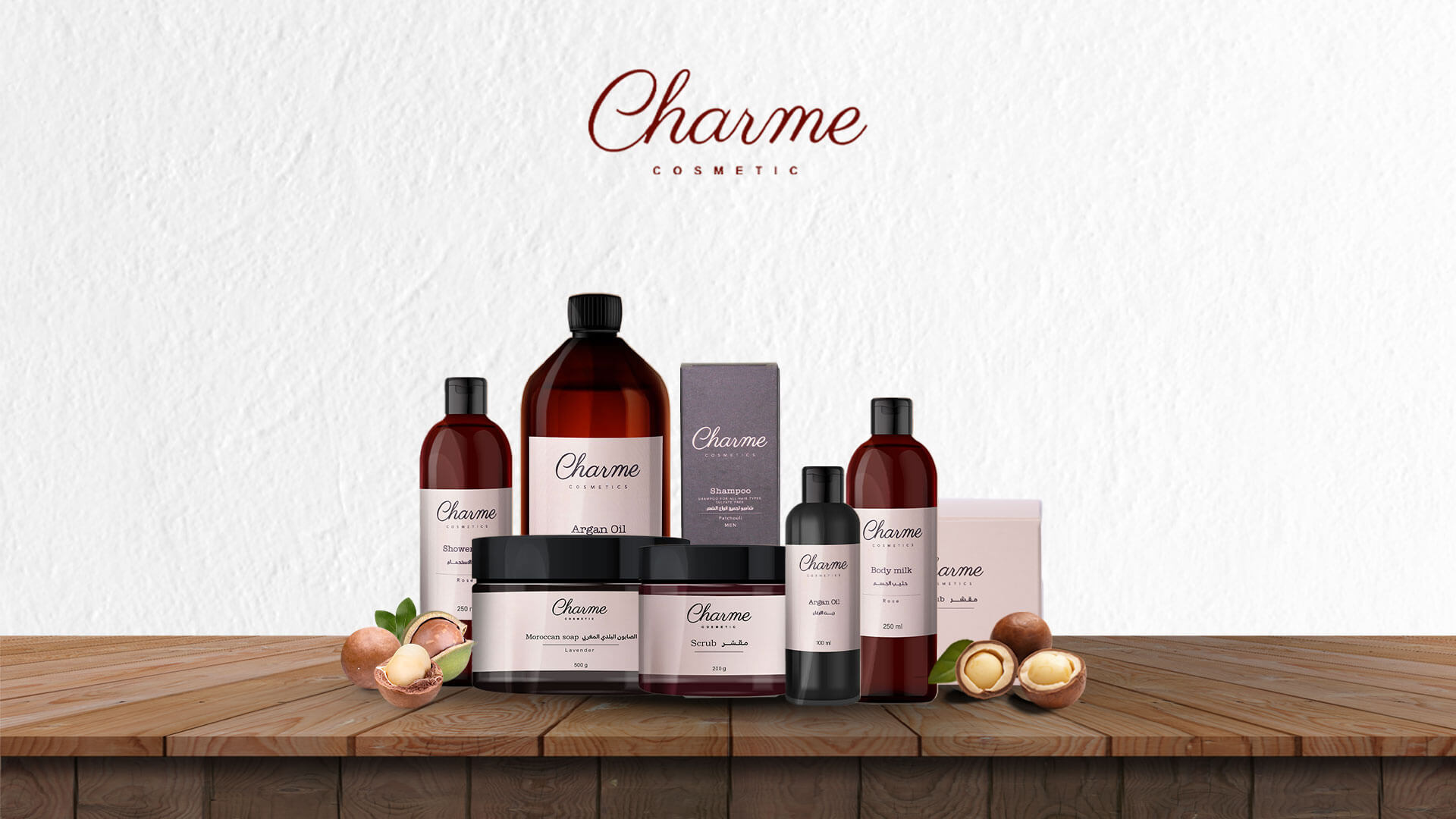
Charme packaging and branding
Charme full brand application
"Design that feels like skincare — gentle, intentional, and memorable."
— Hocine Belmadi, Art Director
Next case study

Taïssir ↗