Key Visual Branding Social Media Print Event Presentations Logos About Let's talk ↗
Case Study 03 / Coffee & Café

COFFEE
HOUSE

Brewed with character — Specialty Coffee & Roastery

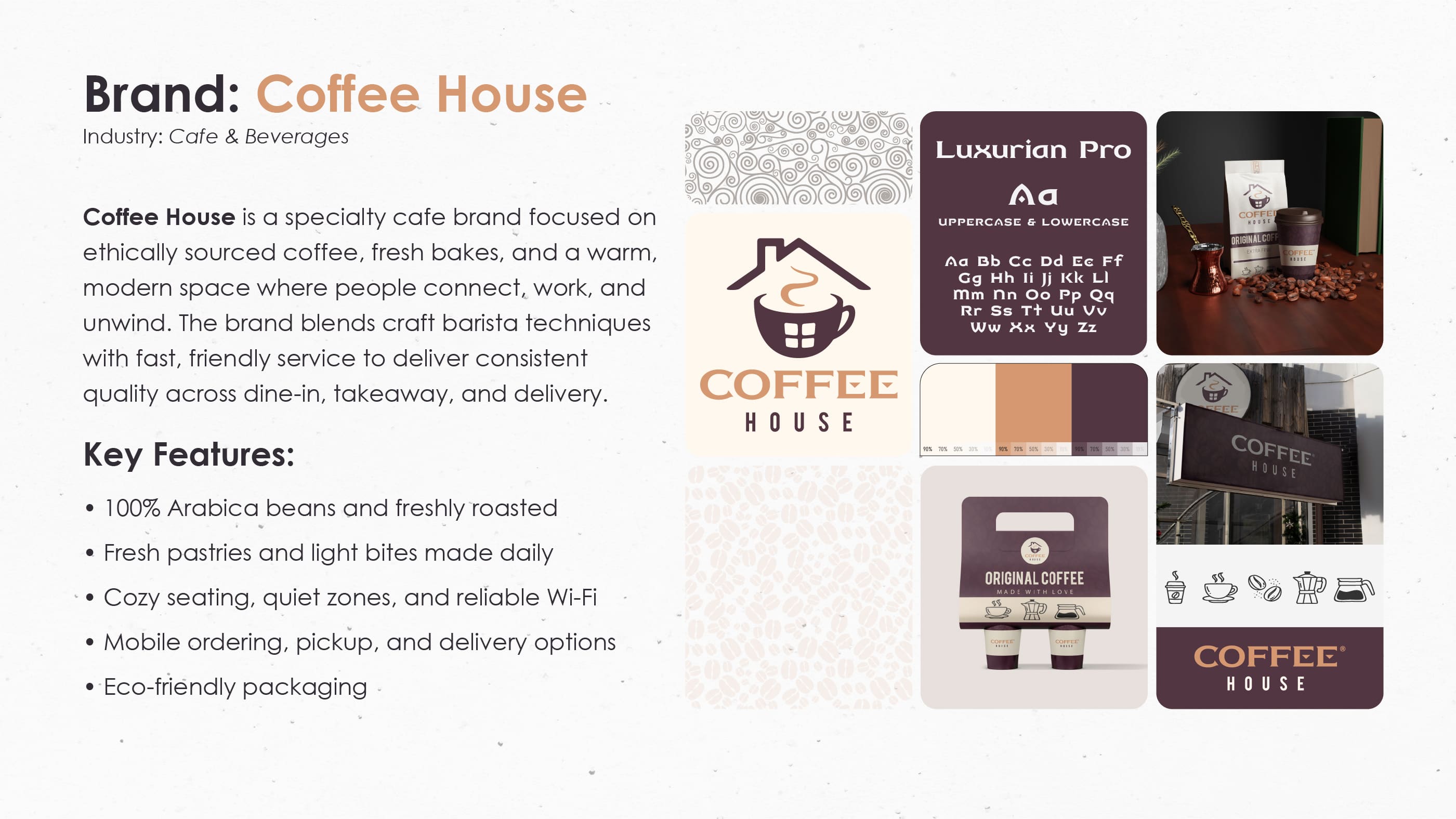
Coffee House is a specialty coffee brand built around craft, warmth and ritual. We designed the full identity: a bold wordmark, a rich espresso-and-cream palette, packaging, in-store branding and staff touchpoints. Honest and inviting — a brand that feels like your favorite corner café.

ClientCoffee House
Year2025
RoleBrand Identity, Art Direction
DeliverablesLogo, Packaging, Retail, Print
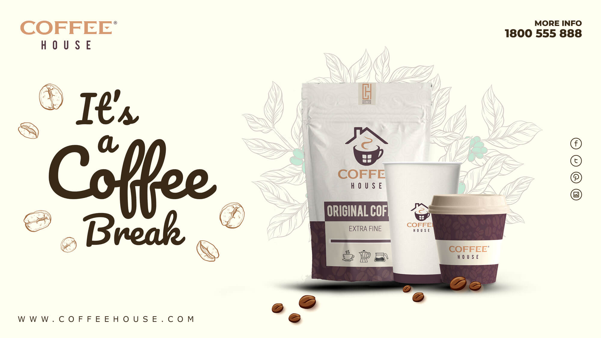
Coffee House — full brand identity: logo, cups, packaging and café branding

The brief

Coffee House needed an identity that could feel artisanal without being cliché — warm, confident and instantly recognizable on a busy street.

Craft in every cup

Coffee House is built on the ritual of slow coffee — carefully sourced beans, precise roasting, and a space where people linger. The identity had to carry that craft: honest materials, rich tones and typography with real character.

The system had to flex from coffee bags and cups to storefront signage and staff aprons — always warm, never generic. Every decision was filtered through three words: crafted, welcoming, and bold.

  • Market Specialty coffee / Café
  • Audience Coffee lovers, urban regulars
  • Challenge Artisanal yet scalable system
  • Goal Warmth + craft + recognition
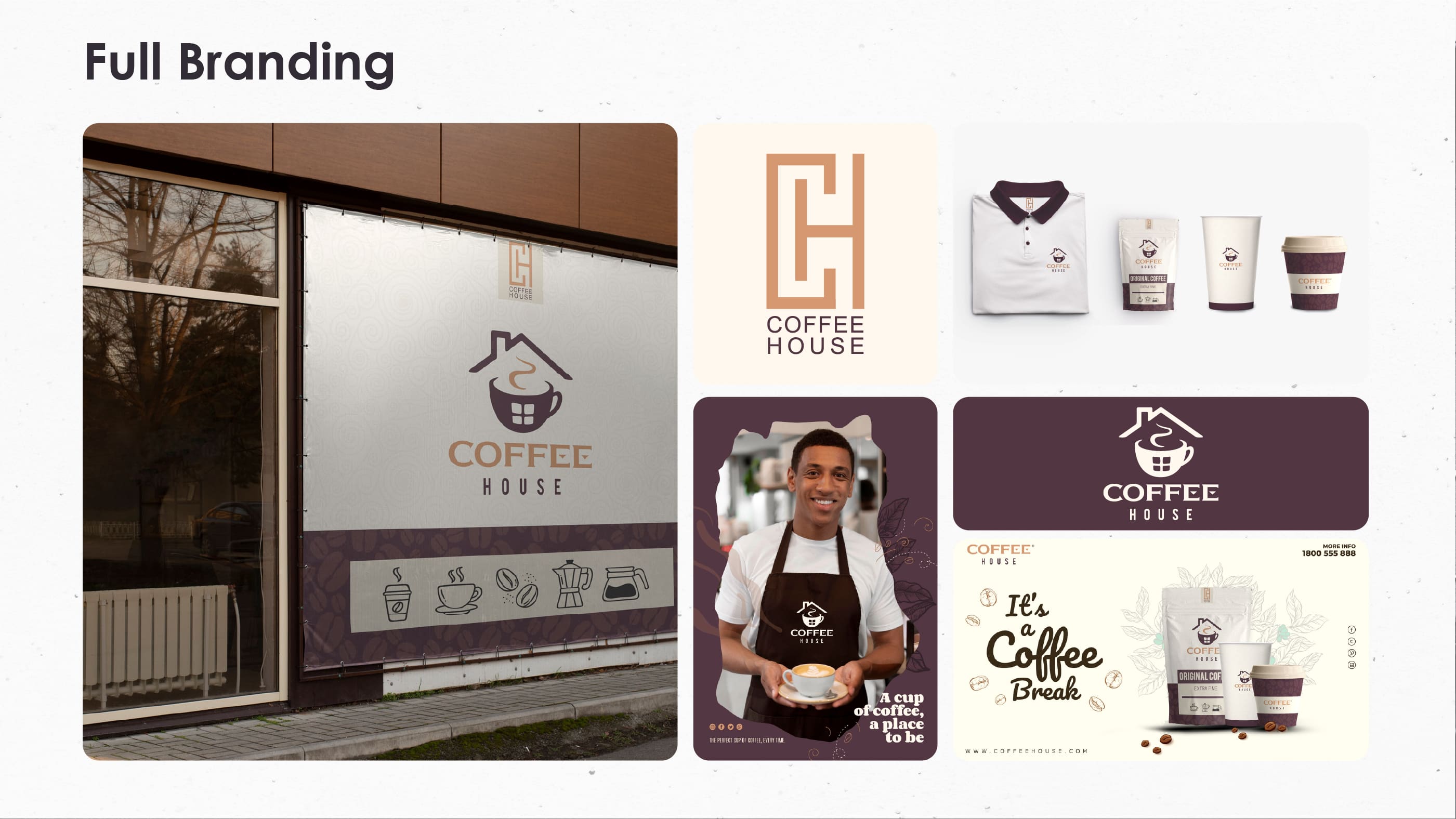
Coffee House brand overview — identity applied across stationery and print

Logo &
construction

A wordmark with the weight and warmth of a good espresso.

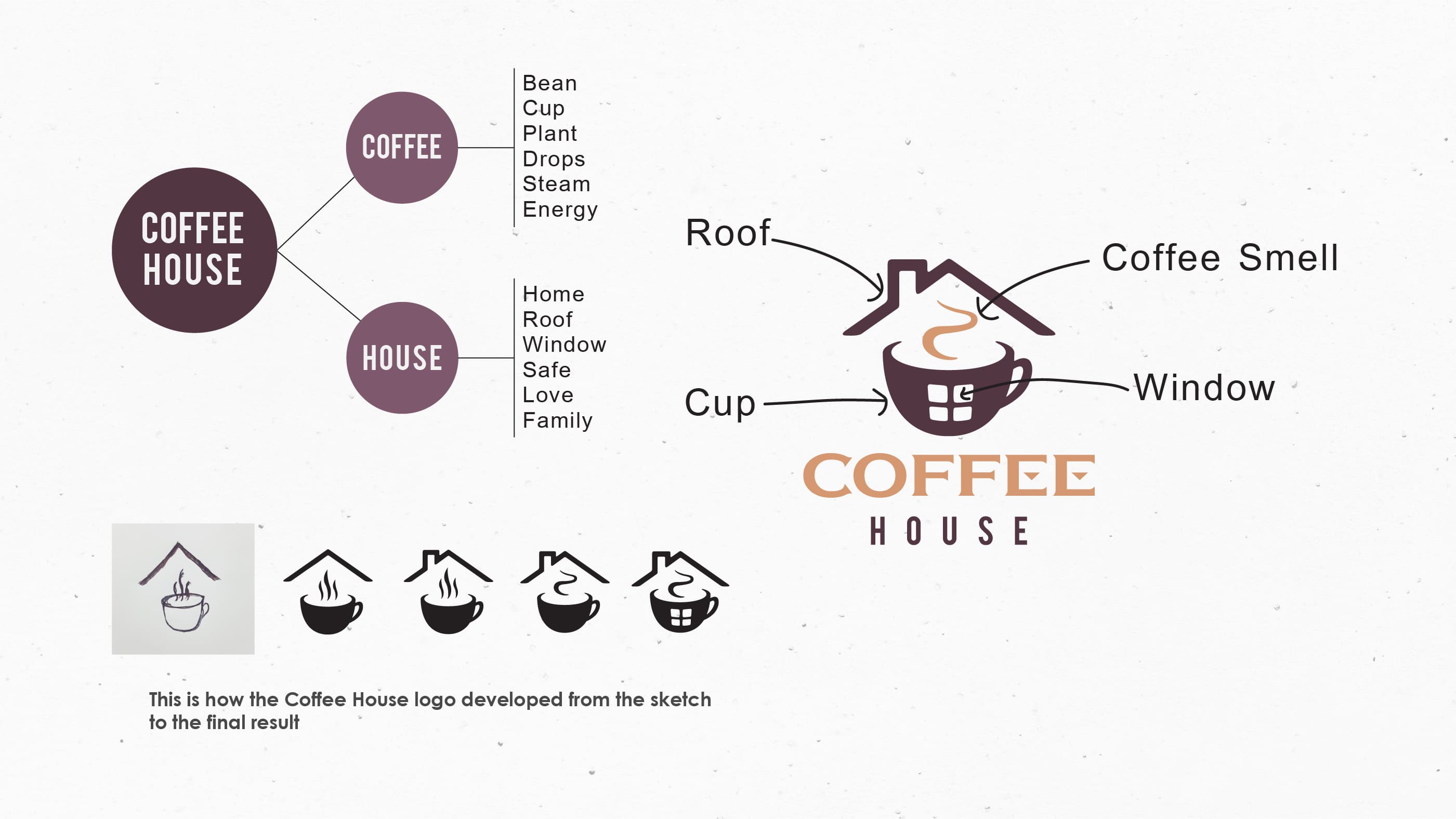
Coffee House wordmark logo design and variants

A bold, friendly wordmark

The Coffee House wordmark pairs sturdy, confident letterforms with soft rounded details — a balance of craft and approachability. It stamps beautifully on kraft packaging, cups and signage, staying legible at every size.

A set of lockups and badges extends the mark across labels, loyalty cards and merchandise, giving the brand a flexible kit that always feels like one family.

  • Style Custom bold wordmark
  • Support Badge & stamp lockups
  • Symbol Coffee bean monogram
  • Variants Primary, badge, stamp

Color &
typography

A palette drawn from the roast — deep espresso, caramel and cream.

Espresso
Roast
Caramel
Cream
Coffee House
Manrope — Display & text · DM Mono — Labels & stamps · Full typographic system

Packaging &
touchpoints

From the counter to the street — one warm voice everywhere.

From bag to barista

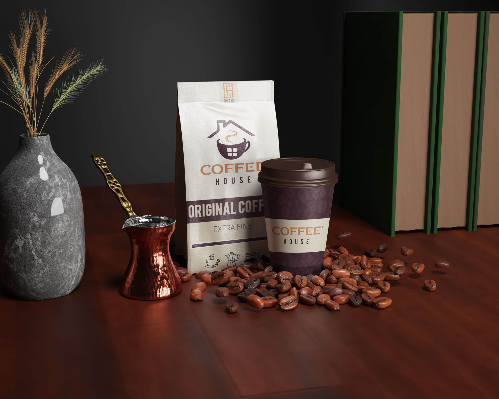
The packaging system — coffee bags, cups and sleeves — uses kraft textures and cream labels stamped with the bold wordmark, instantly readable on any shelf. Rich espresso tones carry the brand with quiet confidence.

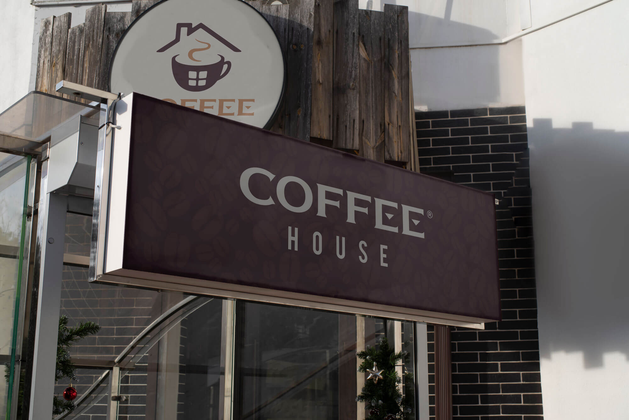
Beyond packaging, the identity extends into the café itself: storefront signage, menu boards and staff uniforms — every touchpoint pouring from the same warm, crafted language.

  • Packaging Kraft bags + stamped labels
  • Retail Storefront & menu boards
  • Staff Aprons & uniforms
  • Print Cards, sleeves & merch
Coffee House coffee cup and packaging
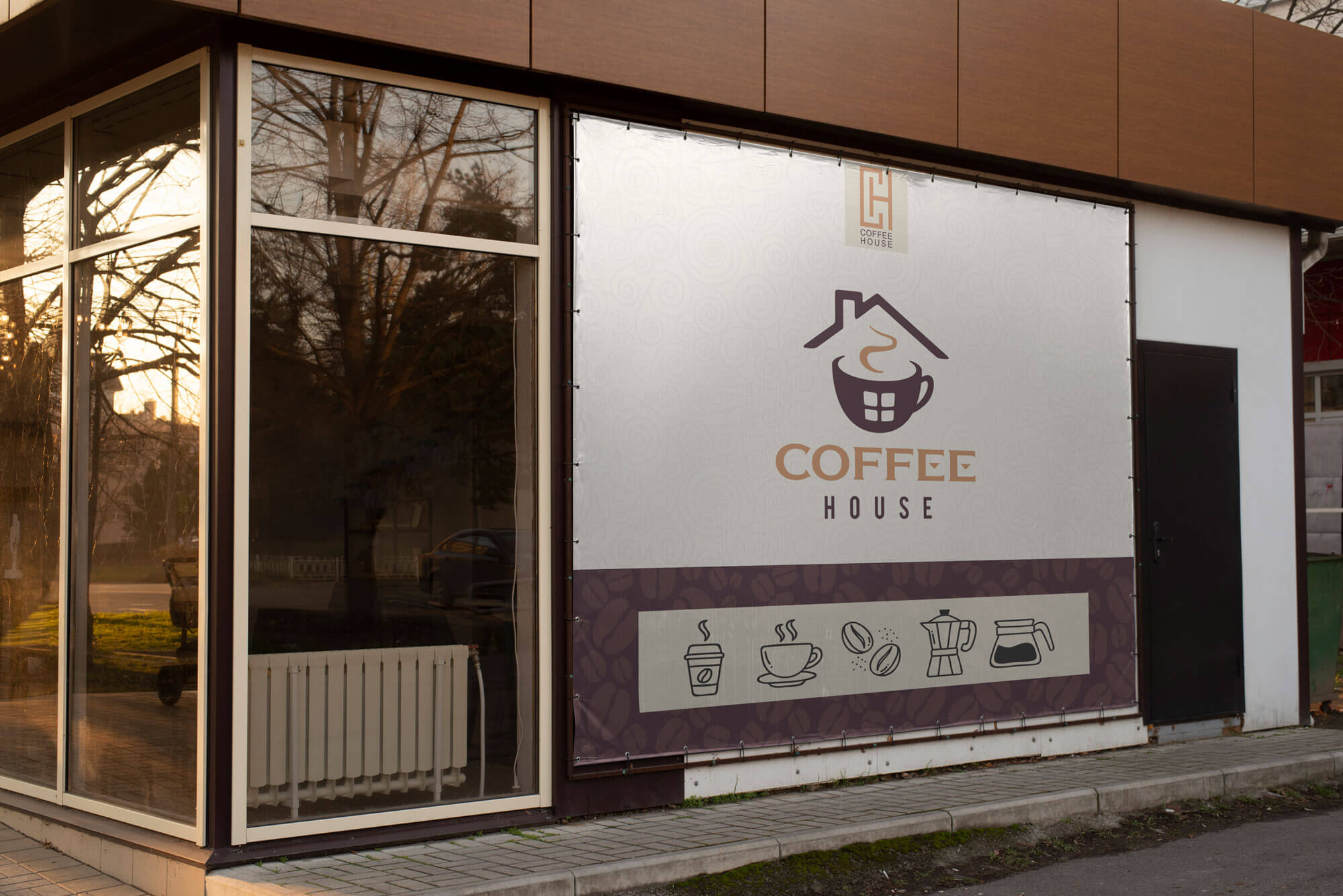
Coffee House storefront branding
Coffee House café interior signage
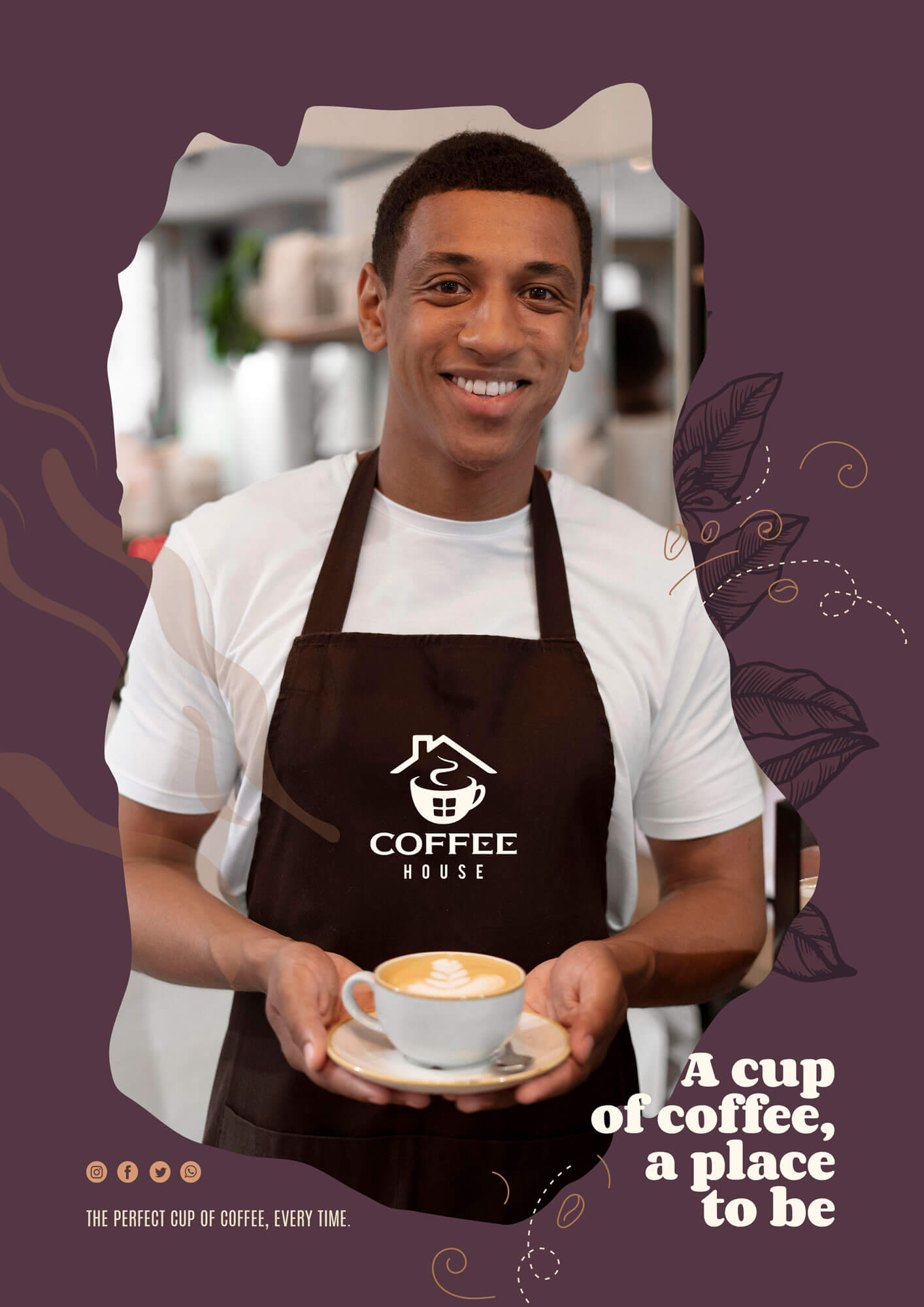
Coffee House staff uniform and apron branding
Coffee House brand details — packaging and print close-ups
"A brand should feel like the first sip of a well-made coffee — warm, honest, and worth coming back to."
— Hocine Belmadi, Art Director
Next case study

Charme ↗